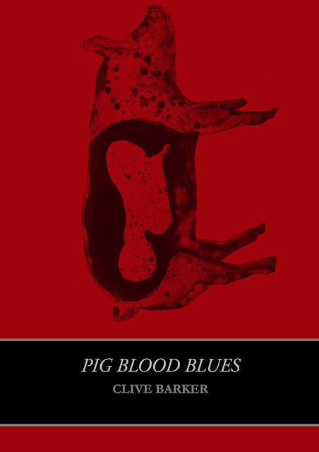
I have decided on the front cover designs for the book covers. They may change again but at the moment I am sticking with these. I want the covers to look the same and look like they belong together as a set.
These six are my favourites so far. I may add more if I have time at the end of the project.
Now we have to start thinking about what we want up in the final show and how we will display our work.
These are some examples I have found but I think I like the idea of having the books mounted on the wall and stuck together so you cant open them ? And maybe larger images up also.
Friday, 26 April 2013
Thursday, 25 April 2013
Front Covers 2
I have started to make my images look like front covers now and playing around with the design inspired by the puffin classic books.
I think the top one works best, so will carry on experimenting with this style.
I think the top one works best, so will carry on experimenting with this style.
Front Covers
I now have a large collection of images for this final project and need to transform them into front covers .
I have been looking at other front covers and like the way some of the publishers stick with a particular style.
I was particularly attracted to the style of the puffin classics collection. I like the way they look like they all belong together with the way the text is in a box but still have there individuality with there own image. I think it gives the book a sophisticated look.
The End Is Near
The work is really starting to come together now and I need to start thinking of how I'm going to put these images together as front covers.
I also have to start thinking of what work I will put up at the final shows and how I will display the work.
Today I have been working on the final image to put in the final shows catalogue and designs for my business cards.
Its all starting to get real now and slightly scary but in an exciting way .
This is the image I have decided to put in the shows catalogue. I think it a good example of my work and best represents me. Fingers crossed other people think so to.
This image will probably appear on my business cards as well.
The yattering and Jack
This is my finished design for The story 'The Yattering and Jack'. It was made using ink and bleach and text added after on photoshop.
I am really really pleased with the way it looks now and my work is starting to surprise me. I am producing work that I never thought I could achieve and is taking on a really different look to what my past work has been like.
I am really really pleased with the way it looks now and my work is starting to surprise me. I am producing work that I never thought I could achieve and is taking on a really different look to what my past work has been like.
Monday, 15 April 2013
Pig Blood Blues
I have been working on an image for the story, Pig Blood Blues, again. I think I am now steering towards this new image? It is painted in water colour onto card board using photoshop.
After I have finalised my images I will put them into a book cover format to see how they would work if published.
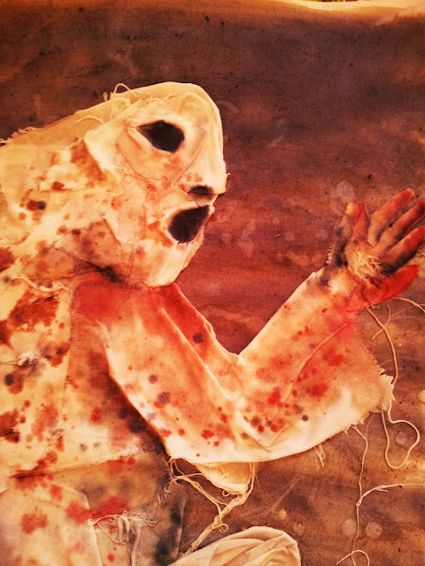
Confessions of a (pornographers shroud)
For this short story a man soul takes possession of a hospital sheet and goes on a murderous rampage of the pornographers that wronged him and killed him. So I wanted to show the sheet man after his rampage with his sheet ripped and dirty and just damn right gross.
I am also in the process of making a death mask type thing to accompany the piece.
I am also in the process of making a death mask type thing to accompany the piece.
Scape -Goat
This was made using ink and bleach. The image illustrates the tale of Clive Barkers, Scape Goat.
The image will have a little more work done to it to finish it off.
And here is the final image.
Book Of Blood #2
This image is for the story Book Of Blood. This was an exciting image to make. It started with a photo shoot with a naked model which I needed so I could get as much skin on show as possible so I had a larger canvas to work on. I then wrote parts of the story on to his skin, which took quite a while down to it being surprisingly ticklish :)
The finishing touches where then pieced together on photoshop. I have a few versions to choose between.
What do you think works best ?
Personally I love them both but need to do a little work to them both to see how they look as book covers.
But all feed back would be greatly appreciated .
The finishing touches where then pieced together on photoshop. I have a few versions to choose between.
What do you think works best ?
Personally I love them both but need to do a little work to them both to see how they look as book covers.
But all feed back would be greatly appreciated .
Friday, 5 April 2013
Self promotion
To day I have been putting together some self promotional mini books to send off to Art Directors and horror book publishers.
I will be nervous when I post them and wish them luck on there journey.
I will be nervous when I post them and wish them luck on there journey.
The Midnight Meat Train
As seen in an earlier blog I focused on the scene of the underground but I quickly went off that idea and looked at the tool of his trade instead - The Meat Cleaver.
I also wanted to try some lino printing which I have not tried in quite few years so this started off totally as an experiment but it soon started to transform into a finished looking piece.
 |
| The Lino plaque. |
 |
| First Print (with added blood splatter ) |
Pig Blood Blues.
away from this really at all.
In this story there is a pig that eats one of the criminal boys from the correction facility the pig is kept on.The other boys think the boys spirit has taken over the pig and it goes on a kind of murderous rampage.
I wanted to show the criminal boy in the evil pigs stomach.
But then I saw this on a t-shirt.
And the image progressed to this. I will try printing with the lino too.
Subscribe to:
Comments (Atom)


